Look Up, Darling. Ceilings Are The Statement Piece You Never Knew You Needed
Look Up, Darling. Ceilings Are The Statement Piece You Never Knew You Needed
September 19, 2024
Why do we spend so much time designing every inch of a room and then completely forget the ceiling? Sure, we obsess over wall colors, furniture arrangements, and art pieces, but that big, empty space above? It’s like the blank stare of a room, just waiting for something more. And lately, I've realized that ceilings are having their own moment—becoming the statement pieces we never knew we needed. Here are a few ceiling treatments that I’ve done over the years to give you inspiration.
For example, imagine looking up and being greeted by intricate fretwork, a design so delicate and detailed, it’s like a lace lingerie set for your ceiling. Add in a soft arch with subtle LED lighting, and suddenly the ceiling becomes a starlet in its own right. It’s one of those designs that draws you in closer, making you wonder, “Is this what I’ve been missing?”
Image Description: A fretwork ceiling with a softly lit arch, creating an intricate and intimate vibe in the master bedroom of Winnetka Contemporary Luxury Home
Picture this: a home theater for two, the lights dim, and suddenly the ceiling lights up with tiny stars, as if you’re sitting under the night sky. But no, it’s not a rooftop date—it's fiber optics. This ceiling treatment is the unexpected romance that sweeps you off your feet, proving that even the most intimate spaces can have a touch of magic.
Image Description: A fiber-optic constellation ceiling in a private home theater, turning a cozy movie night into a celestial experience under a starlit sky at our Winnetka Contemporary Luxury Home Project.
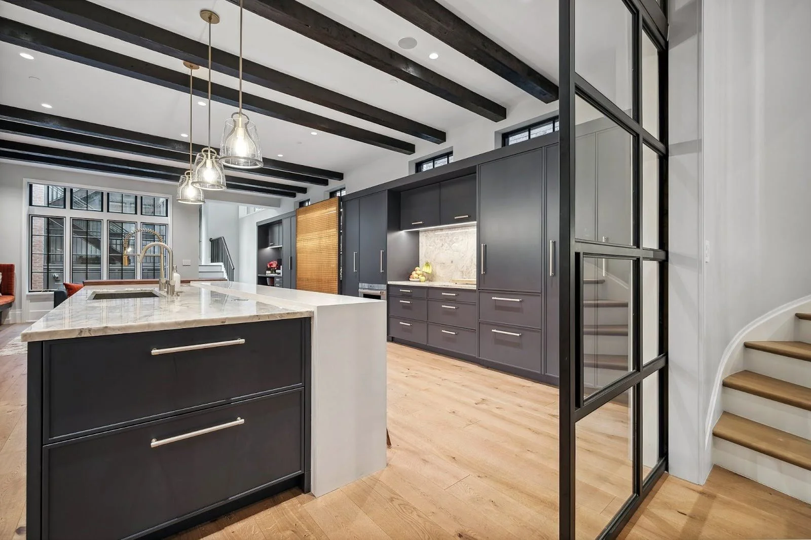
What about faux wood beams? It’s moody, textured, and architectural. Think of it as the bad boy of ceiling treatments. It’s a little rough around the edges, but undeniably attractive. In a way, it gives the room a sense of history, like you're suddenly sitting in a rustic cabin in the woods, even if you're just lounging in your living room. Char the wood and suddenly it’s a sleek, modern situation.
Image Description: Charred faux wood beams stretch across the ceiling, adding a moody, architectural feel to the room—like the rebel you can't help but love at our Lincoln Park Wonderland Project.
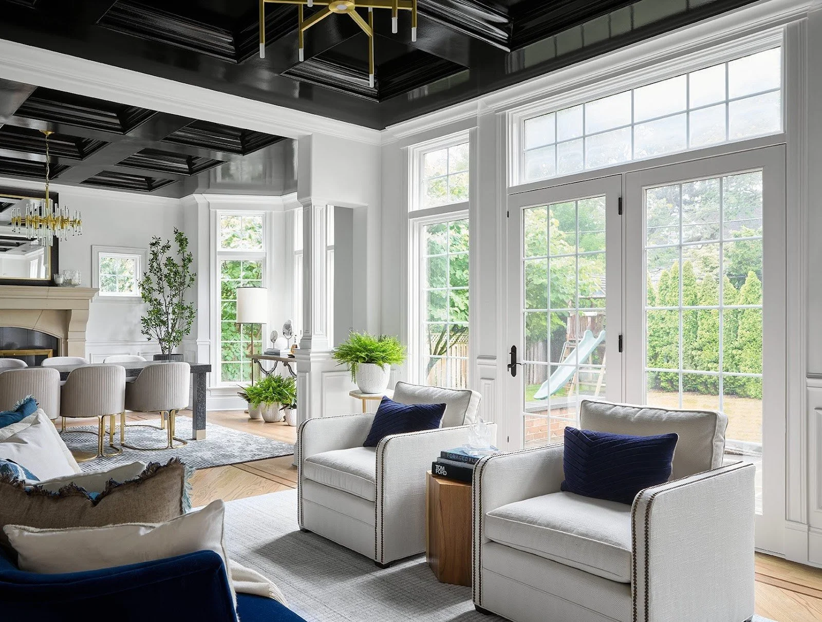
But maybe you’re more into the high-gloss types—smooth, polished, and impossible to ignore. That’s where the lacquered ceiling comes in. In one project, we took a coffered ceiling and coated it in high-gloss black lacquer. It’s bold. It’s glamorous. It’s like wearing a little black dress to a dinner party—elevating everything around it and making the room feel impossibly chic.
Image Description: A high-gloss black lacquer coffered ceiling reflects light and creates a dramatic, glamorous look—turning this ceiling into the ultimate showstopper at our California Farm House Project.
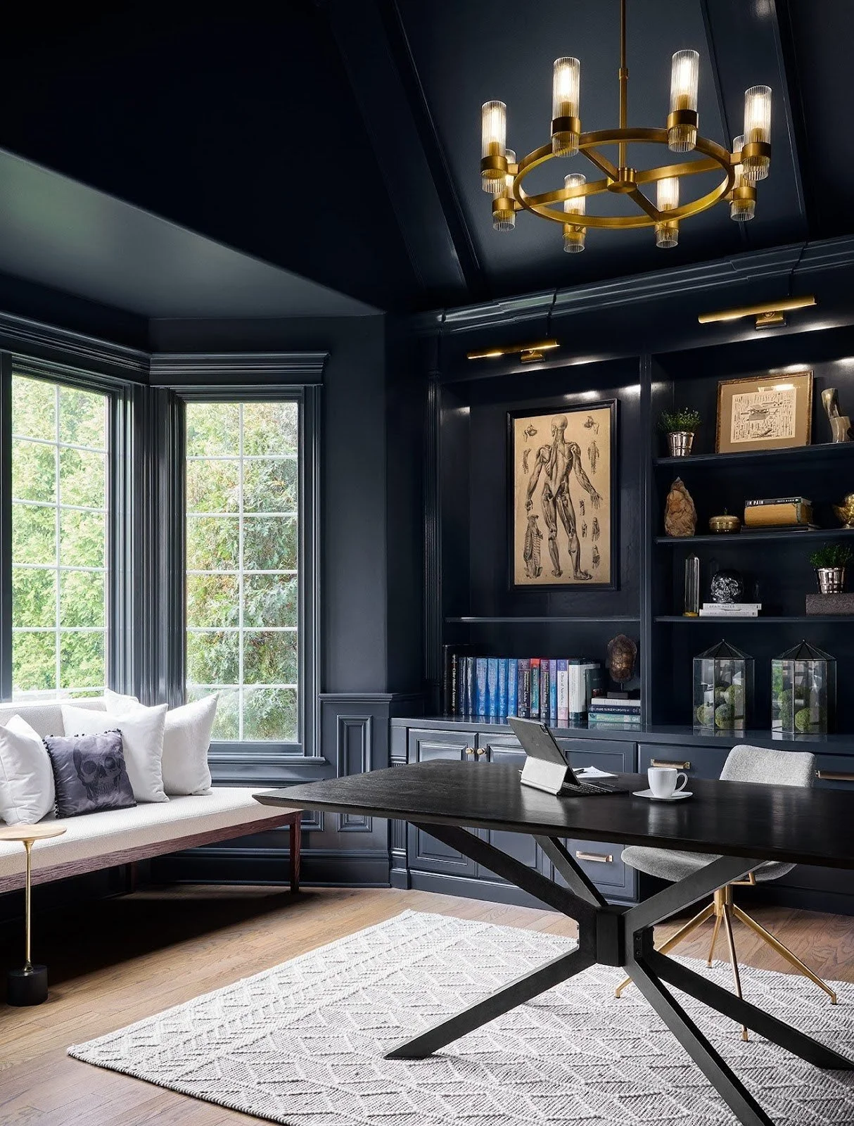
Sometimes, though, the ceiling doesn’t want all the attention. It just wants to blend in, like the perfect pair of nude heels. In a vaulted ceiling project, we painted the ceiling the same color as the walls and cabinetry to create a seamless, flowing space where nothing distracts you. The result? Pure continuity. It’s calm. It’s cohesive. It’s like that moment when everything just falls into place.
Image Description: A seamless vaulted ceiling painted the same color as the walls and cabinetry, creating a sense of calm and continuity in the space at our California Farm House Project.
And let’s not forget the faux beams that brought a British pub to life in a basement. Rustic, a little gritty, and full of character, this ceiling makes the room feel cozy, like you're sharing a pint with friends. It’s casual yet curated—like you just happened to pull together the perfect vintage look.
Image Description: Faux wood beams in a basement create a cozy, British pub vibe, adding warmth and texture to the space for a laid-back, welcoming feel in our Destination Basement Project.
Finally, there’s the painted ceiling. It’s simple, understated, and yet it speaks volumes. In one project, we painted the ceiling to match the rest of the room, giving it an effortless, minimalist feel. It’s like the ceiling knows it’s beautiful but doesn’t need to shout about it. Sometimes, less really is more.
Ceilings may not be the first thing we think of when designing a space, but maybe they should be. After all, what’s above us can change how we feel about the room around us. So, next time you're lounging on the couch, look up—because your ceiling might just be the next great love story in your home.


